living room updates!
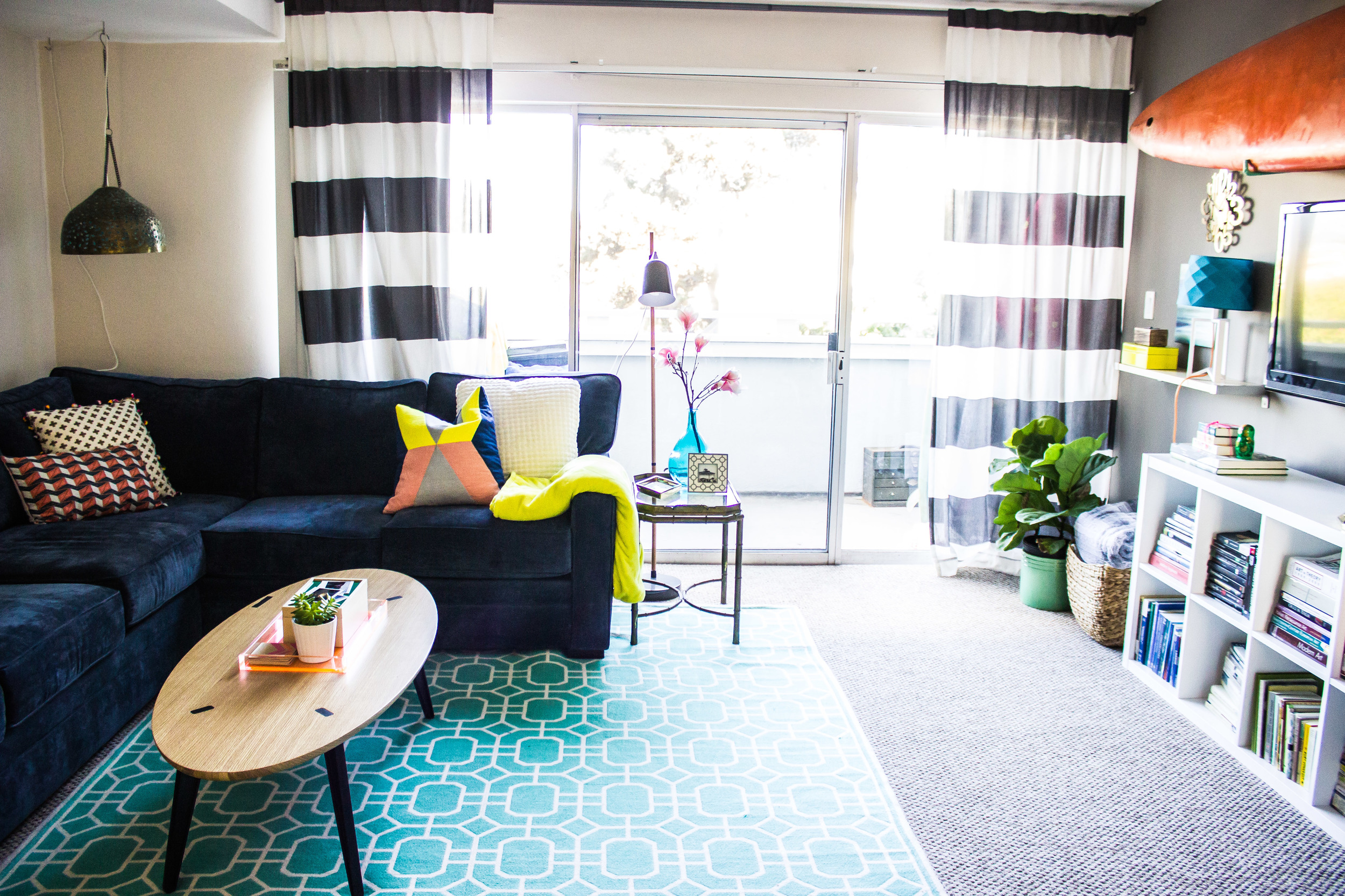
/i have been itching to start putting christmas decorations up already, and am worried i'm going to pull the plug soon. these nesting instincts have hit hard. but before i start decorating for christmas i wanted to share of of the progress i have made on our living room downstairs. remember how last time i shared pics i had a huge to-do list of unfinished things?? i am proud to say that i have completed all of those things (and some things that weren't on the list)! as a reminder, this is where we were at:
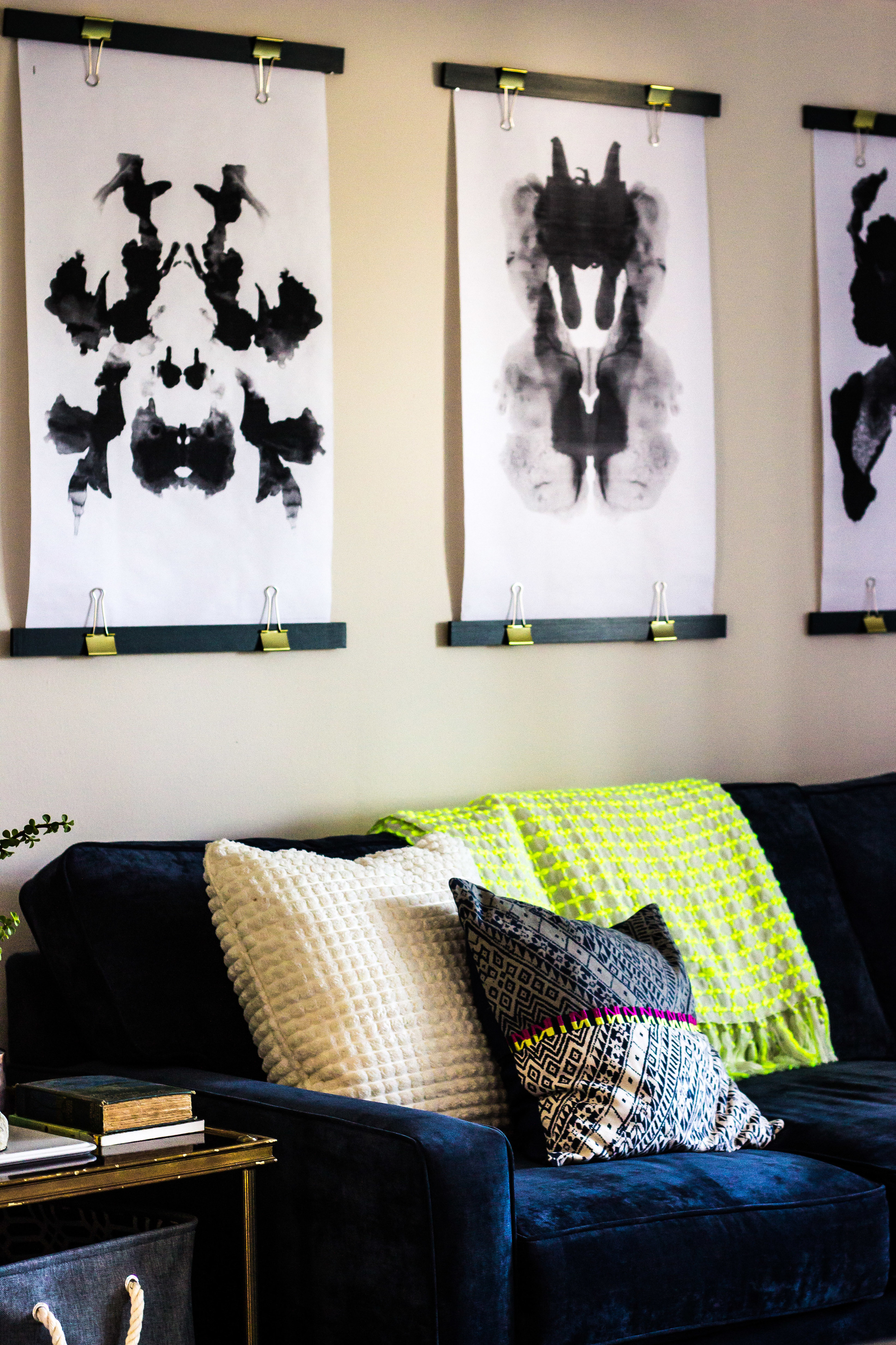
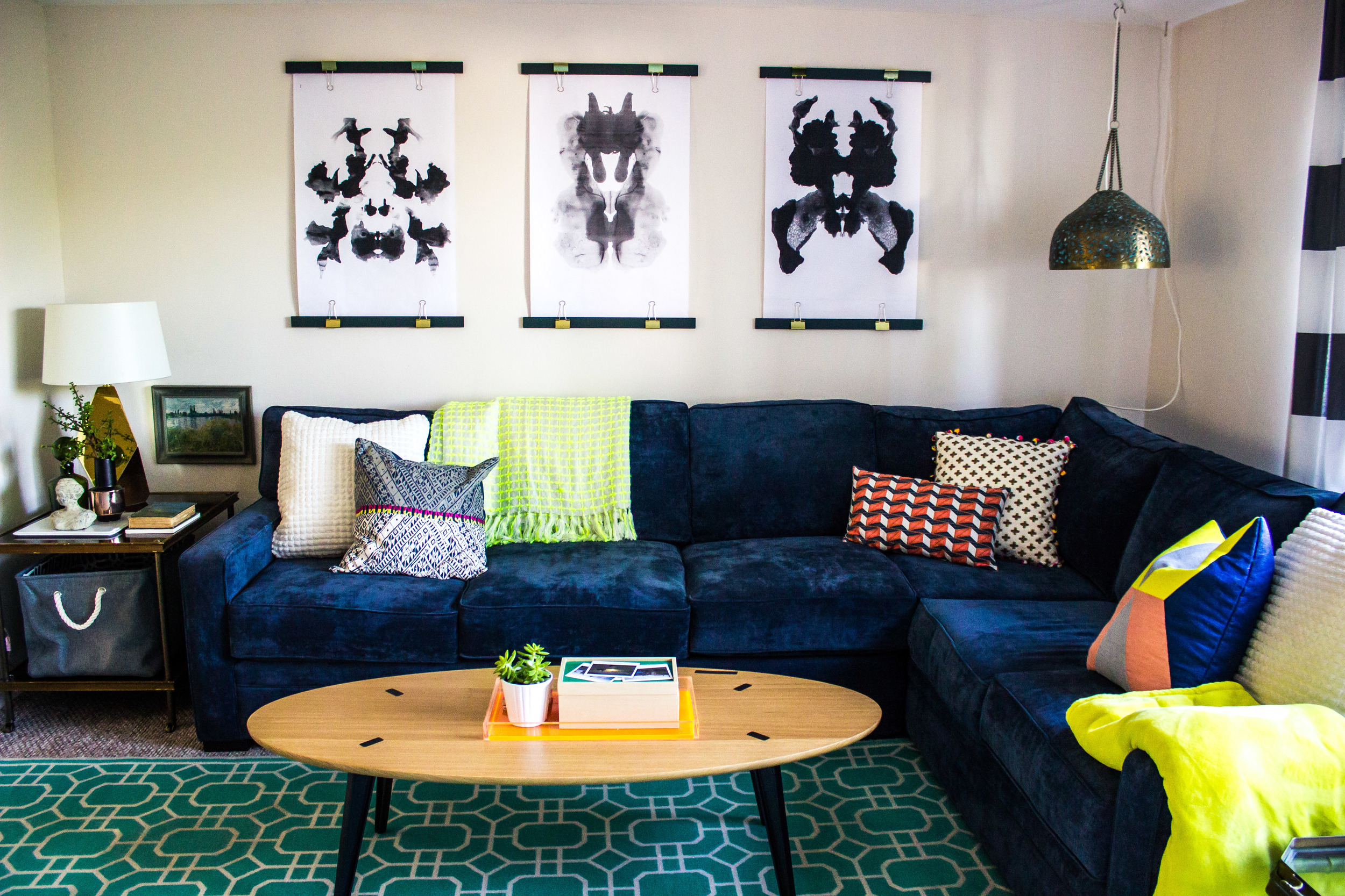
i knew i wanted something big above the couch (rather than a gallery wall of smaller pieces). but, big things cost more money than i wanted to spend. so i started with the idea of engineer prints. at first i wanted to have something printed that i photographed myself (architecture, beach scenes etc.). none of it felt right. i had these rorschach prints that i had been hoarding and decided to try those out. i found an easy tutorial for these diy makeshift 'frames'. all they are is a piece of wood ($1.50 each from home depot), painted emerald green and clipped to the prints with giant gold paper clips (10/$5 from staples). the whole project was less than $25. i do think the rorschach prints look somewhat anatomical in black and white, but i like them for now. it's nice to know that if i decide to switch them out at any point i won't be losing much money! i have also debated on adding two more to the sides to make it an even more dramatic wall. what do you think?
we also moved the hanging light into the corner, and my gold lamp to the opposite table. we added two more lamps to the room (on the other side) because lighting is a major problem in this house. we have tons of natural light during the day, which is awesome, but at night there is like nothing. no recessed lighting whatsoever. it drives me crazy.
my mom stylized all my tables for me (little details are not my forte). i got a basket to collect all of our stray things- books, laptops, etc. jarman still complains that he doesn't understand my 'basket system' and that we have too many (there is another where he is supposed to put his shoes- it's super complicated.)
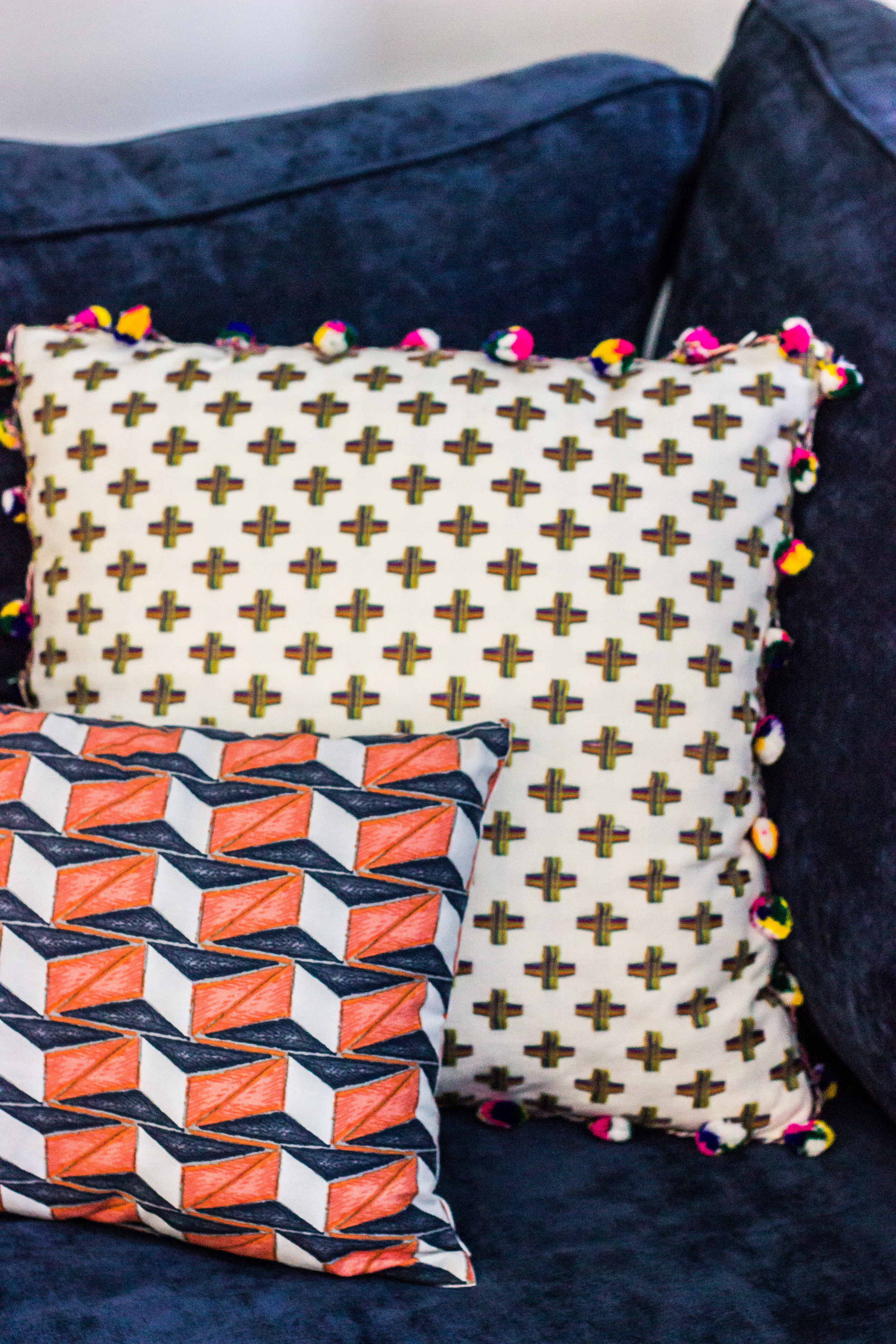
i am obsessed with my new pillows- i got the one with the tassels on sale at anthro, and the little one from west elm.
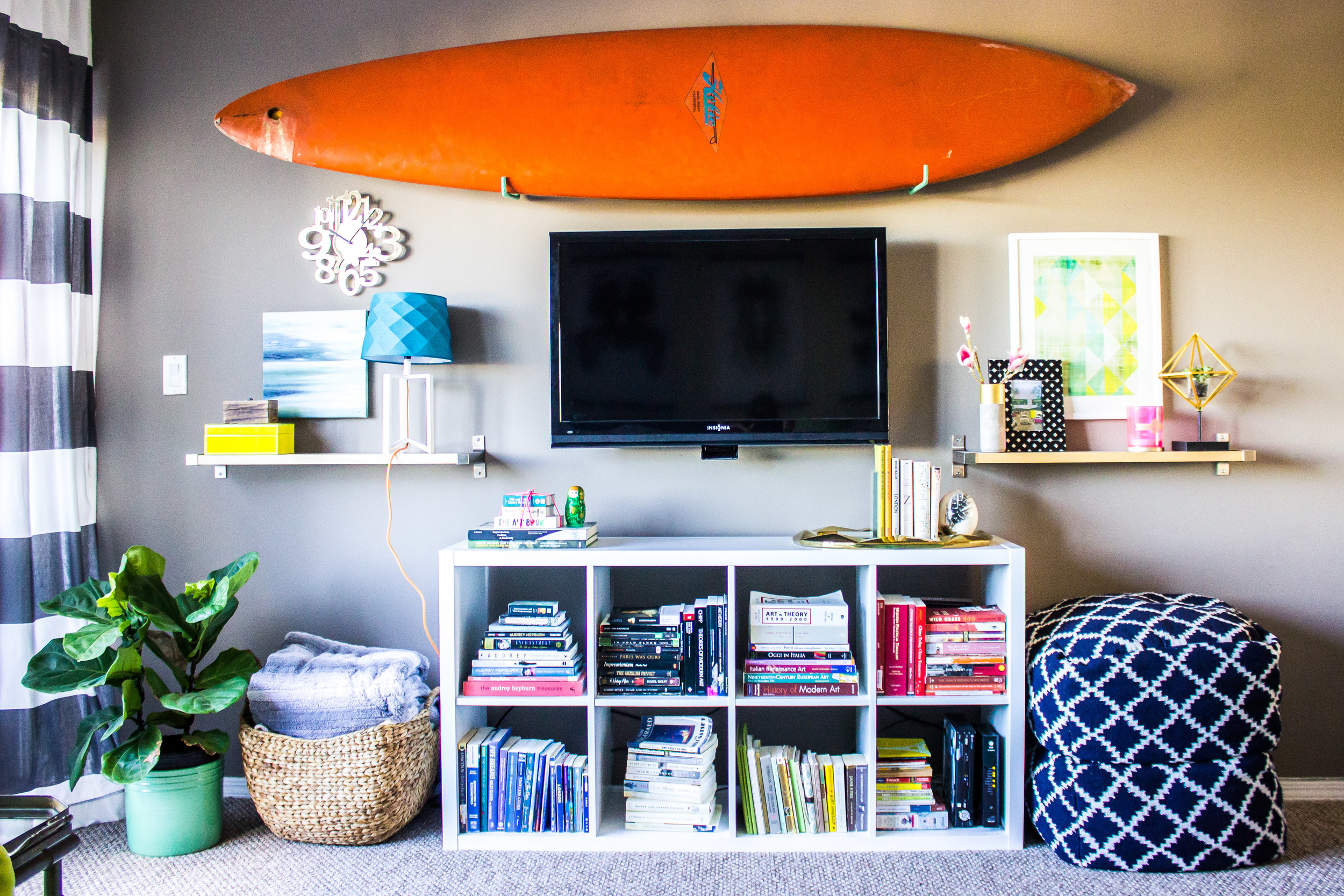
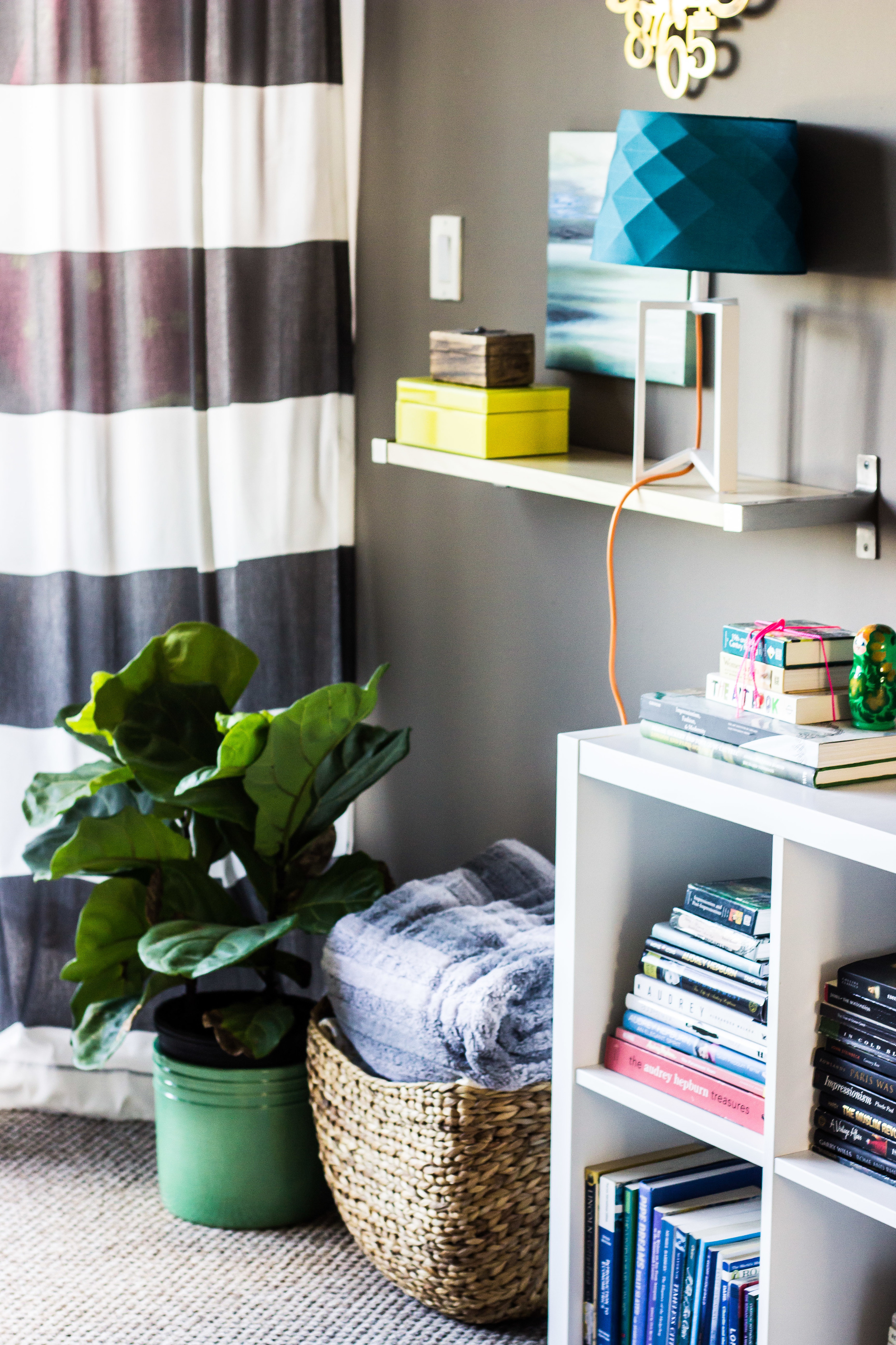
on the other side of the room are some minor updates- the shelves have been rearranged and i added a basket for blankets (creating more confusion for jarman.)
we added simple grey and white striped curtains ($30 for the pair from tjmaxx). they perfectly frame our lovely vertical blinds (which are the worst things in the world). i sort of wish i had gotten another set to cover the blinds more, but i have looked and looked and haven't seen them again. also, did you know ikea has ridiculously cheap curtain rods? i'm talking $6.99 for the our 10.5 ft space.
my most favorite recent update might just be the small peach wall in the dining area. i have been dying to paint something peach lately- and since i'm having a boy i couldn't justify using it in the nursery. so my mom painted this little wall for me last week and i am obsessed (though jarman is not so fond of it). this is definitely the house of accent walls. but since it's a rental we don't want to commit to painting everything so it is just easier to add pops of color here and there. it is also the house of ugly flooring. berber and the worst linoleum in the world. i can't wait to own my own house!
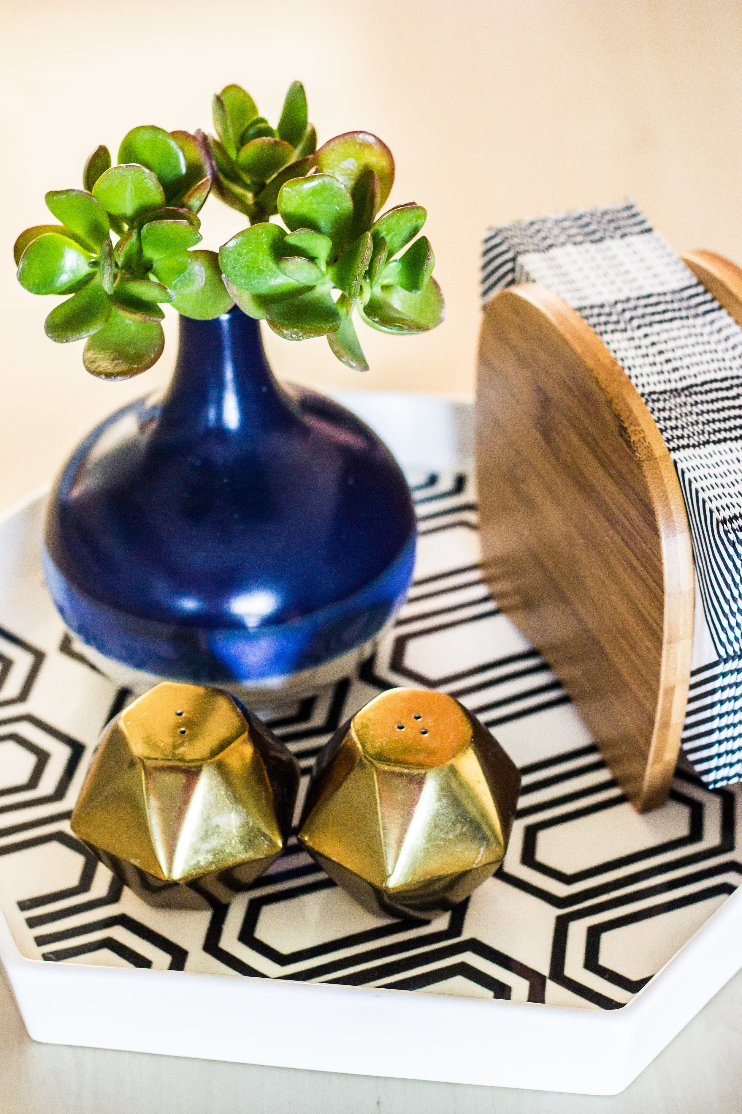
a few more detail shots:
love our little breakfast nook.
also, i promise to post pics of the baby's room soon. it was pretty much finished but we are having some problems with a sagging shelf that has caused the whole room to be torn apart. hopefully we will piece it back together this week and i can get a post together for next week.


