rue / breakfast nook updates
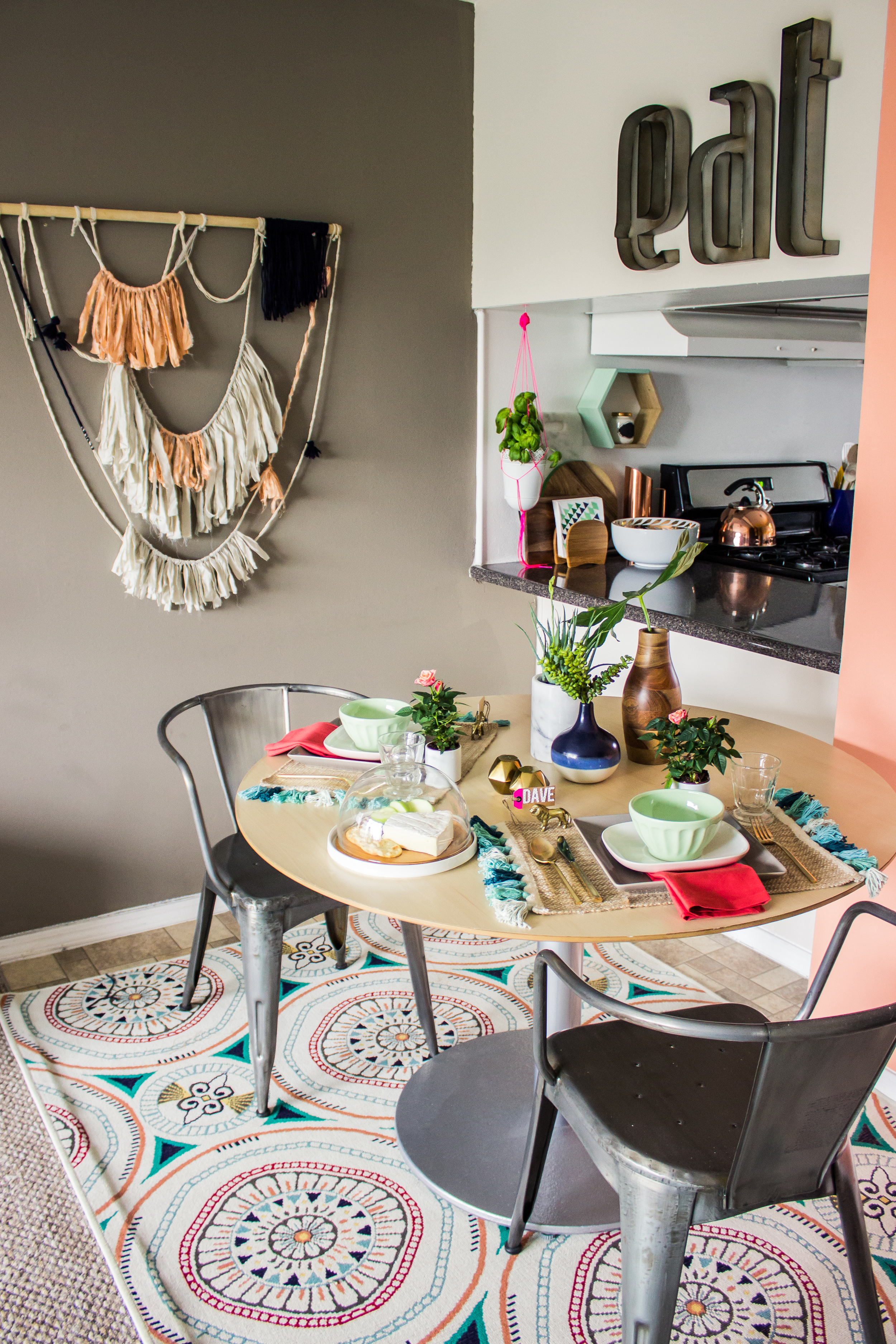
/the last time you saw my little kitchen nook it was rather depressing. to freshen it up a bit i added that diy wall hanging, the rug (which is an outdoor rug i found at target for $50!), the planter (the most amazing thing i found at west elm), and the 'eat' sign. i pretty much love all of it. the space feels so cohesive and bright; i love how the rug pulls in so many colors of the room. it almost seems like i planned everything else around the rug, but i actually put it in last. i'm pretty sure it was fate.
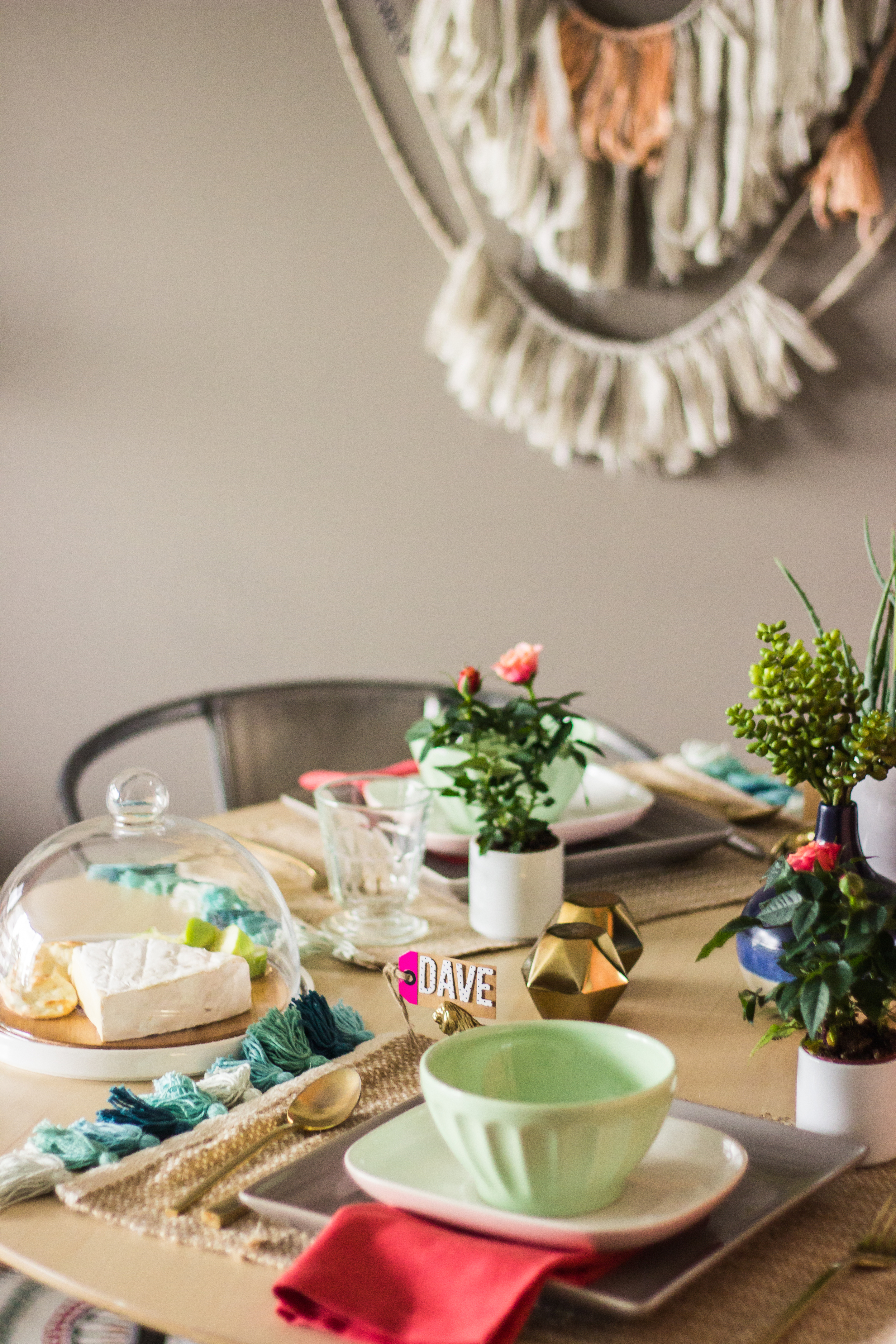
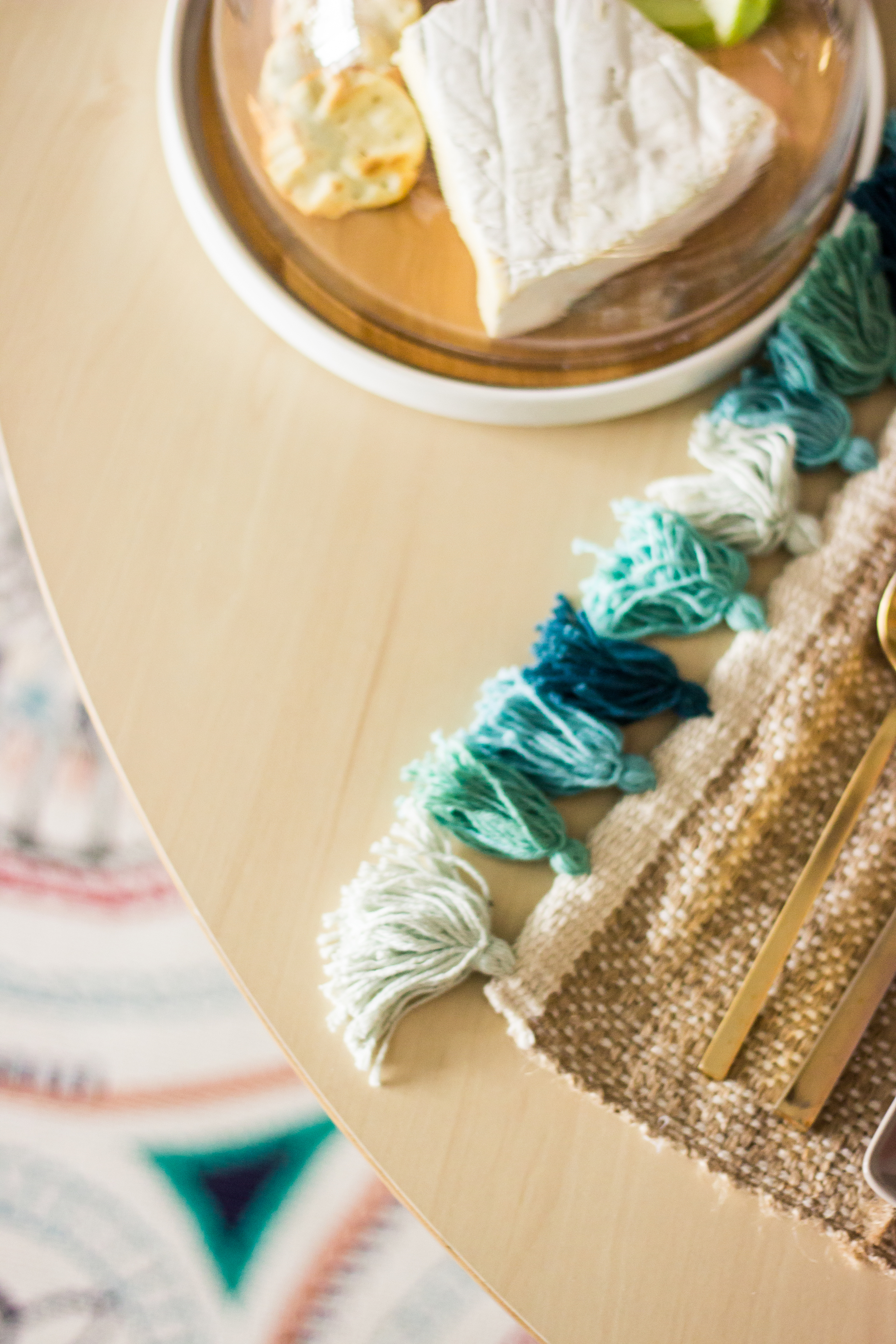
bobette did my tablescape for the shoot. she is a pro at tablescapes and i'm more of a big picture person. she used a lot of the stuff i already had (the grey plates, bowls, gold flatware, geometric shakers) and she brought a few new things to mix in. the tassel placemats and pink dishes made the biggest statements.
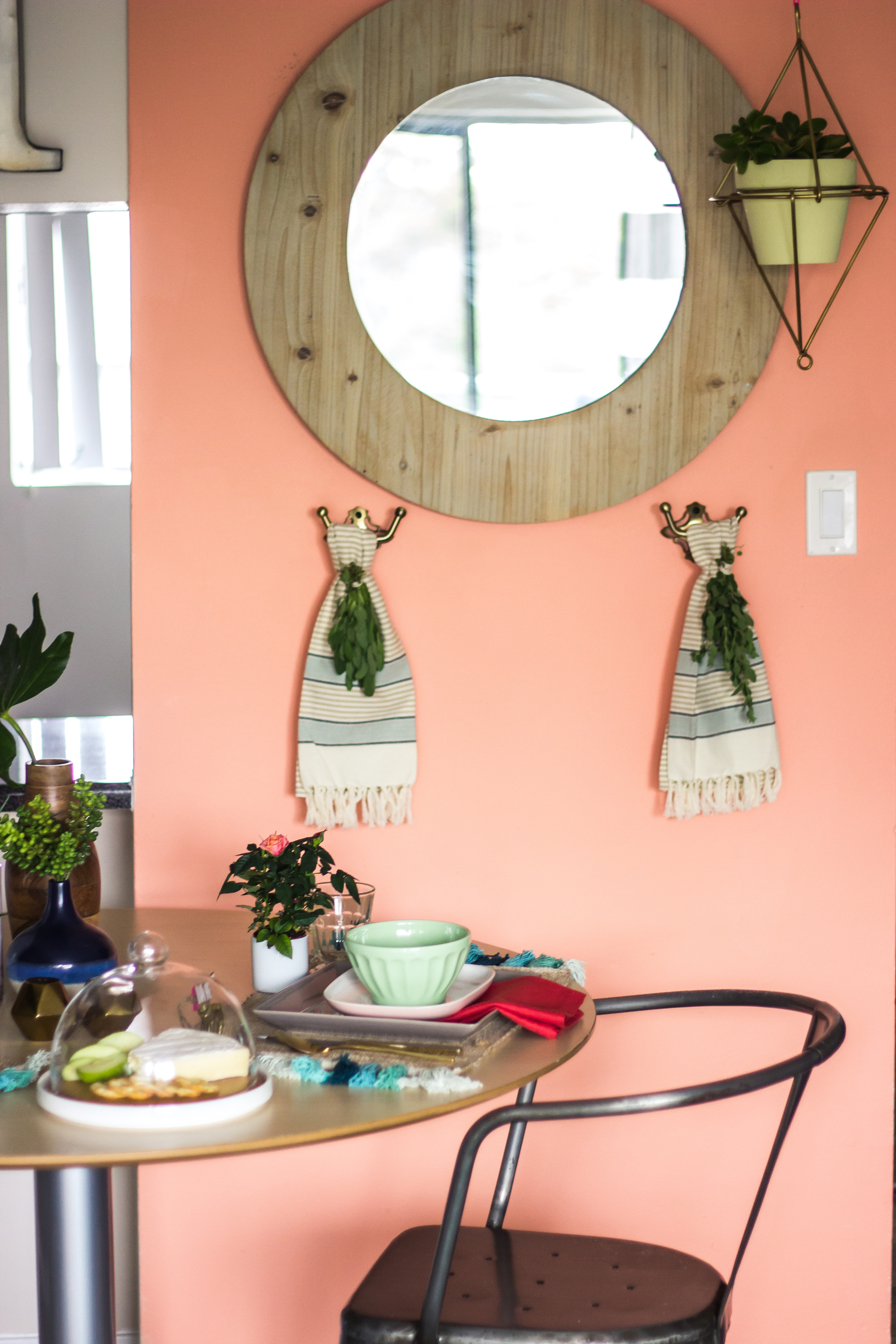
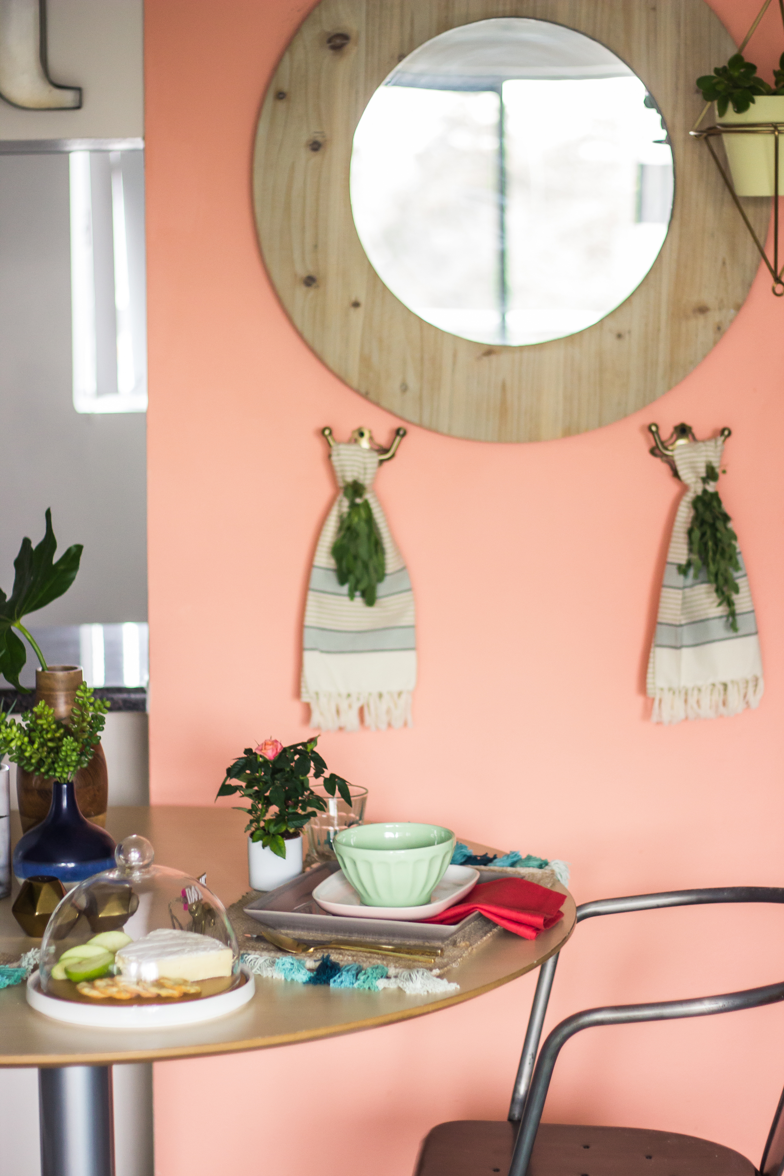
i'd like to be able to say we have an 'open-floor plan,' just because it sounds so chic, but really it's just a small space with a small dining area. it works for us though. the dining area is grounded on its own rug and has its own color scheme (with lots of coral), which helps it feel as though it's separate from the rest of the room.


