a first peek at our new apartment + apartment hunting tips
/we have lived in our own house again for 3 weeks now, and let me tell you - it is the best thing ever. it has been over a year now since we had our own place (in dc we lived in a studio in student housing that was all prefurnished, and in temecula we lived with my in-laws). we were so ready to have a space all to ourselves. housing in san diego is not cheap, and our budget doesn't allow for many luxuries. after lots and lots and lots of searching (and crying), we found a place that is perfect for us right now. we hope to be here through law school (3 years), and as of right now it's looking like we will like it for that long- but you never know.
while we were still in the casually looking phase, we made a list of the things that were important to have in our new place. after looking at over a dozen places- we found that there will never be a place that is perfect by every standard. especially when you are on a budget. you just need to figure out what things are most important to you, and which things you are willing to give up.
our apartment search had its highs and lows. the first place we looked had the best location (in regards to being close to the school), but other than that, it was a crap hole. so then we started looking at 'luxury' places and considered getting a one bedroom apartment. i quickly realized a. how sad i would be to not decorate a nursery, and b. that we wanted something that would last longer than a year. eventually we found a place that was perfect, but of course just out of our price range. we tried to scramble a plan together of how we could afford it, but by the time we were ready to commit it was already taken, causing lots of dramatic wailings and gnashing of teeth. anyways, i'll share my list of what was important to us, and what things we got/had to compromise on.
1. location- we only have one car so we needed to be close to school. it would also be really beneficial to have a bus route for days when i wouldn't be able to drive jarman. i also wanted to be really close to a grocery store/good shopping center- a really well put together shopping center with the right amount of restaurants and stores gets me way too excited.
our location in proximity to the school is perfect. we take one road (not freeway) straight there- meaning jarman could potentially ride a bike or get a motorized scooter (which i wouldn't allow if we were further), plus there is a bus route. so far i have just been driving and picking him up.
i had to compromise my shopping center a little bit. there aren't many stores right by our complex, but that just means i have to go to mission valley/fashion valley for all my shopping (which takes about 5 minutes and two exits on the freeway). i'm not complaining.
2. space- i wanted two bedrooms, for obvious reasons. we almost considered giving this up, but like i said before it ended up being really important to us. we also wanted to be able to have guests over and have space to host them in. and we needed outdoor space because we love to grill- which we didn't realize would be as big of a consideration as it was. after not having a grill in dc though, we knew we would want to have one here. we also knew we would want lots of storage space.
our apartment is on the bigger end of what we were looking at. it's 950 sq. feet, 2 beds and 1.5 baths (that half bath was a nice little surprise). it's actually a town home so we have two floors, and no one above or below us. we have our own outdoor entryway, and a balcony for our grill. our bedroom is bigger than any bedroom we have ever had, and the baby's room isn't tiny. we have our own closets- major plus. the only space that is really lacking is the kitchen- there is hardly any cabinet/drawer space, though it is bigger than our kitchen in utah. we remedied this with open shelving that turned out nicely- so it was no big deal.
3. amenities- our must-haves were: a dishwasher and garbage disposal (jarman has done dishes for 2 years and is so over it), air conditioning (you would be amazed how many places in sd don't have air conditioning- we would literally die), pool (for me and baby). things that would be nice included: hardwood flooring, laundry hook-ups (we had a washer and dryer from jarman's grandpa), parking space, lots of natural light.
we got most of the amenities we wanted, but sacrificed the hardwood flooring and laundry hook-ups. a lot of the small luxury places we looked at were gorgeous on the inside, but it just wasn't worth it to us. our apartment is older (1950's i think), but has been remodelled in the past 10 years and upgraded somewhat. we have really ugly berber carpet, the worst linoleum i have ever seen, and vertical blinds, but those are really all just cosmetic issues that aren't that big of a deal (though i will try my hardest to cover them up!). we did get our dishwasher and it has been amazing. there is a communal laundry room steps away from us (which is a hassle, but whatever). our place has huge window in almost every room, which i love.
4. price- obviously this was huge for us. we started with a budget, but realized that we wouldn't be able to get anything up to our standards so we stretched it a little bit above.
overall this is what we learned:
- craigslist is kind of the worst. it is sketchy- so many people tried to scam us with fake credit checks. we started going about apartment searching the wrong way, and quickly learned that craigslist wouldn't work. we used forrent.com and other sites like that a lot to find complexes and then made a list and called around.
- make a list of questions for your calls. ours included availability (first and foremost), move-in dates, deposit, monthly payment, sq. footage space, bedrooms/bathrooms, and floor # (i forgot to mention above that i really wanted to be in a first floor apartment, with baby coming and all- it ended up to be a non-issue with the town house we got). and then i would go through the list of amenities that were on our list to see what made the cut.
- go spreadsheet crazy. so when i asked all these questions i filled out a spreadsheet so we could compare all of the apartments by looking at one page. it was awesome. i also included contact info, and dates/times for appointments. i have since become addicted to excel, to jarman's dismay.
- drive around and look at area's before you look at the actual apartment. this makes a huge difference. jarman was really concerned with finding a safe space for me and baby- some of the places looked and felt sketch from the outside. you never know what a neighborhood is going to be like until you drive through it. we also got the advice from a realtor to go to a complex at night to see what the nightlife is like- whether it's a college/party area, or a quieter more family oriented one.
- realize that no place is perfect. we looked at over a dozen places and still had to make compromises. i can't imagine what it's going to be like buying a house!
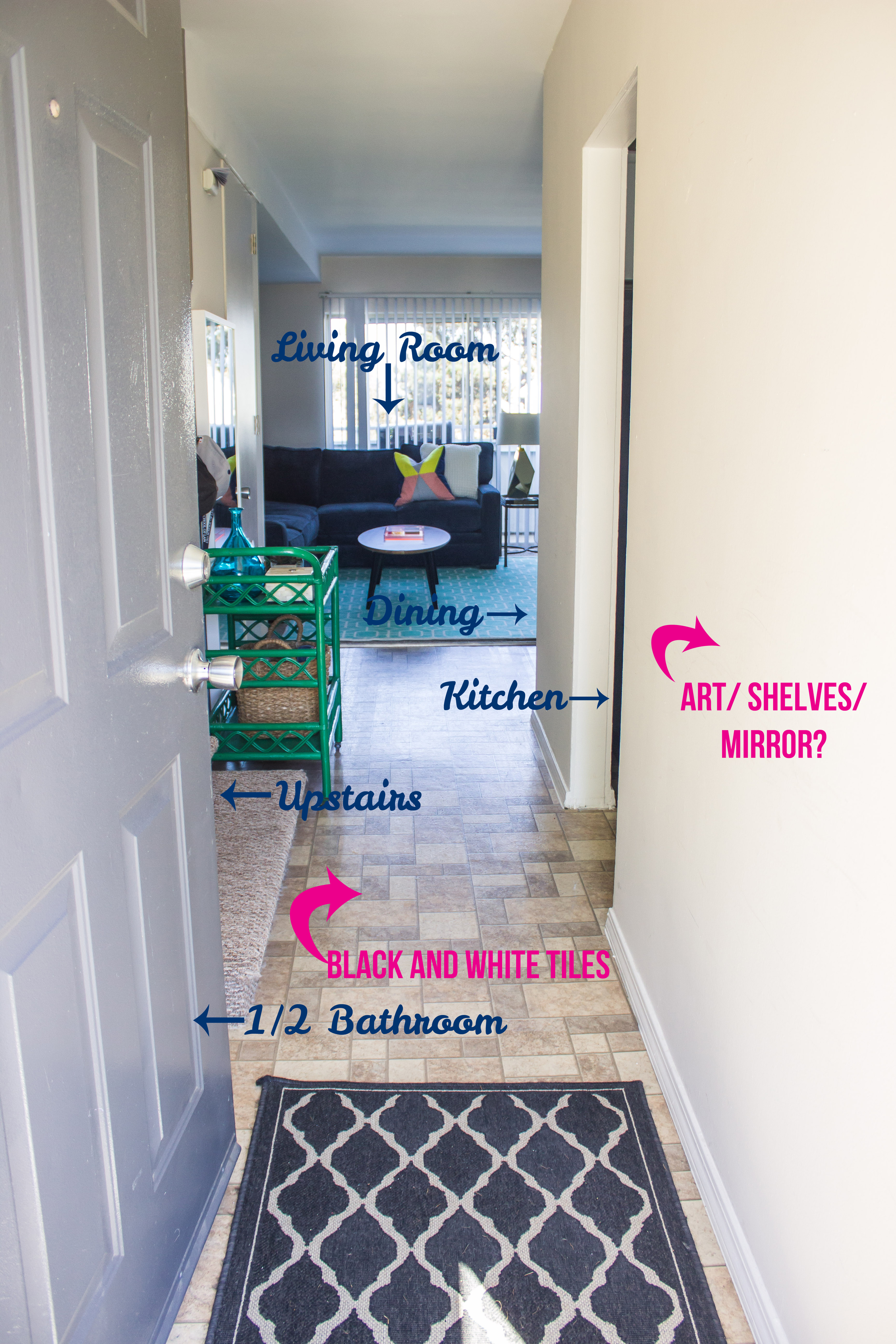
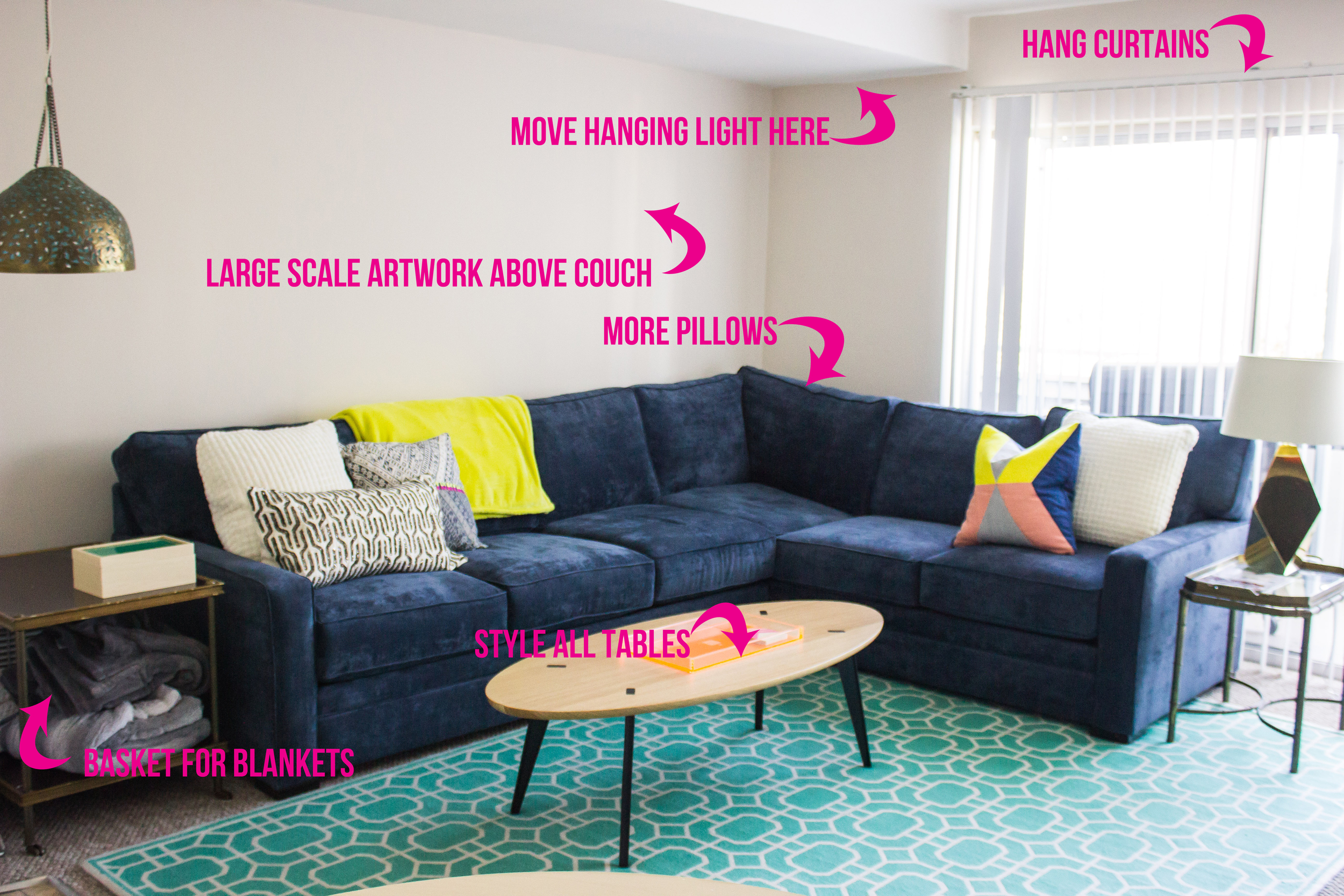
wow! that was a lot of writing. let's get to the more exciting stuff now, i'll show you some first pictures of our house. keep in mind it needs a lot of work, but this is what we are starting with! everything in pink is what need to be done.
here is what you see from the front door:
this is our little makeshift 'foyer'. i turned my barcart into an entry cart where we could throw keys, hats, mail, loose change, etc. plus a basket for jarman's school stuff and shoes.
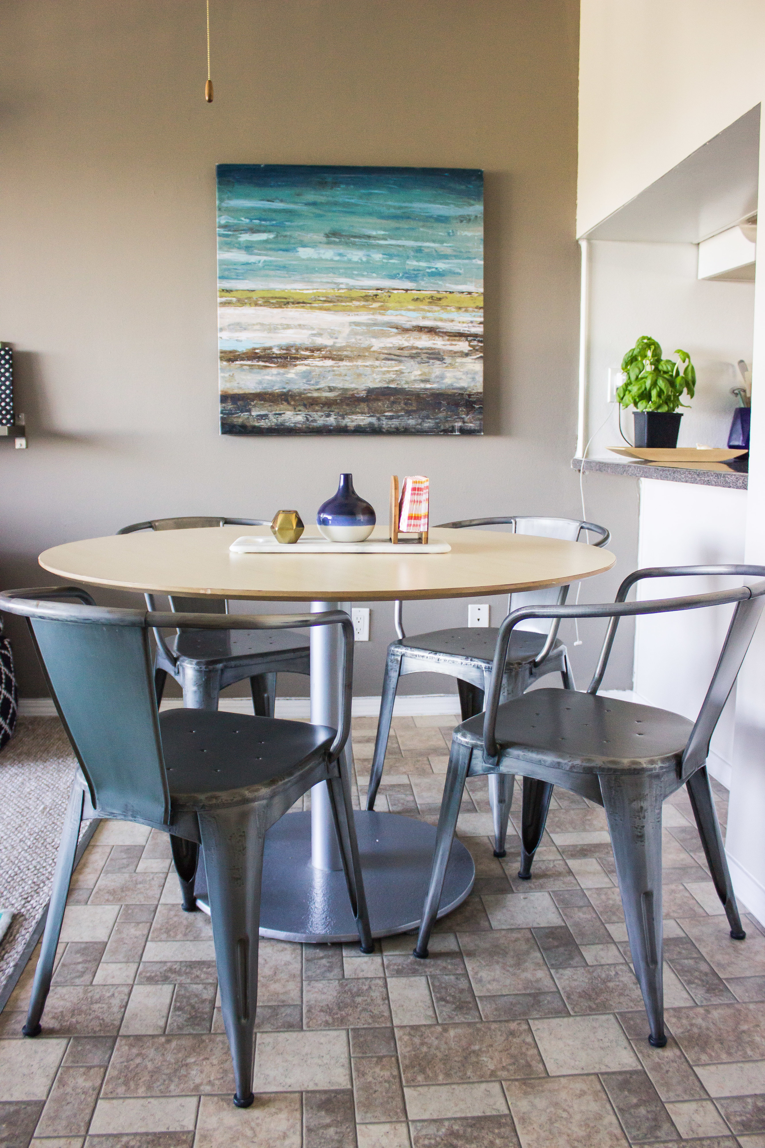
here is a view of our whole living/dining area. i was so happy to have a space carved out for a dining table (it was rather undefined in our old house).
i stole this cute table from my mom (and gave back the one she had previously given me)
possibly the most complete area of the house, though we still need to fix/hang the artwork and clock. we got that surfboard from grandpa jarman and i am obsessed with it. we used regular c-hooks to hang it, but i covered them in washi tape first. naturally.
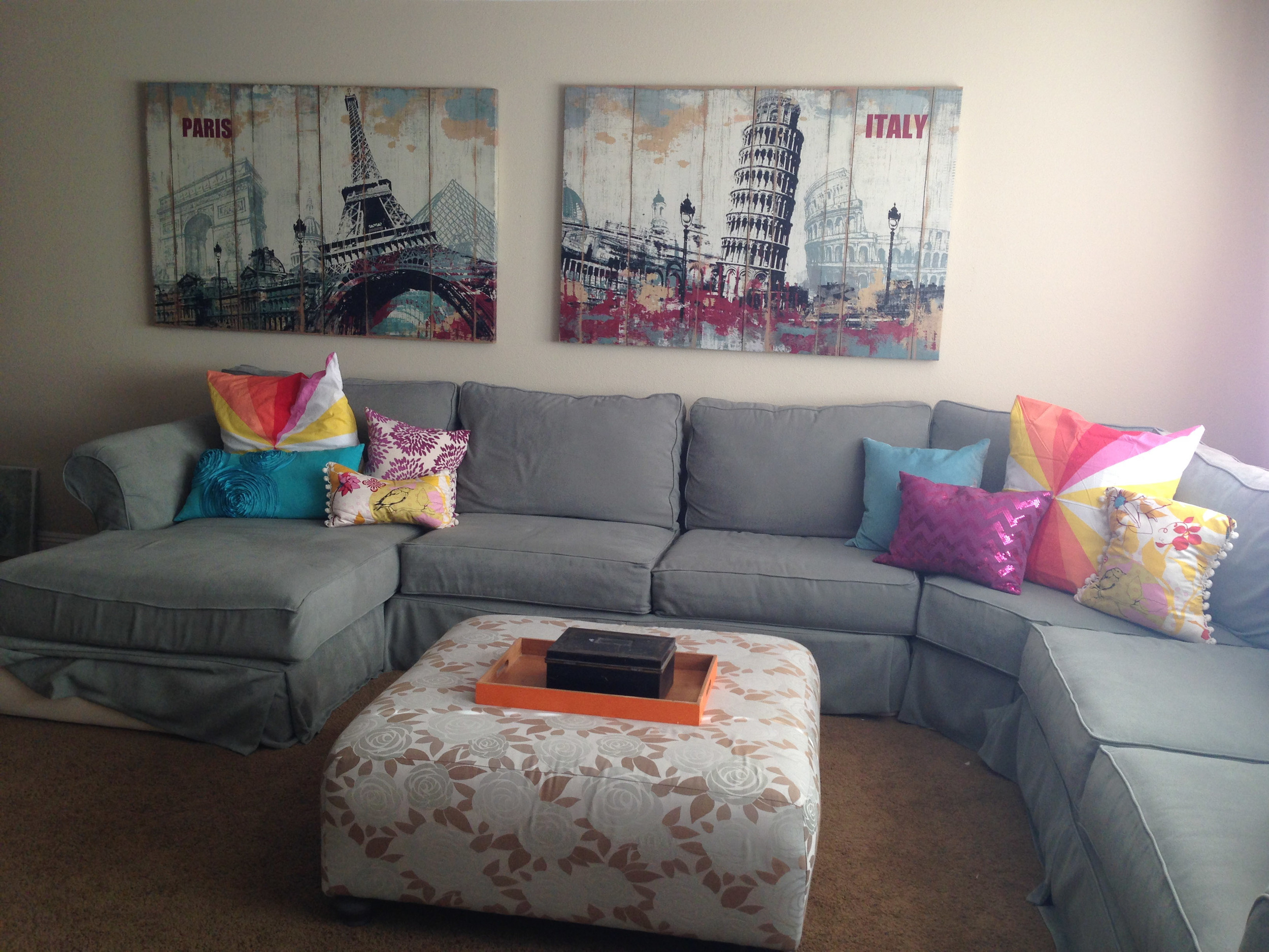
though this part of the room needs the most work, it just might be the most exciting. because we purchased our very own couch. it was the biggest thing we had bought since we have been married (though jarman liked to brag that my engagement ring was more). it was such a huge decision. i sold my old couches, and the washer and dryer that we had- so we had a pretty good chunk of money to work with. i, of course, wanted to get a couch from west elm- but i also really wanted a sectional. we got this from living spaces which is probably the most underrated store ever. you can choose a custom fabric at no extra cost and their turn-around time is only 2 weeks! (west elm's, btw, is 8-10 weeks). our last couches were so cushy and comfy it was hard to get jarman to agree to anything less cushy and comfy- but these ones totally make the cut. they look more modern, are a better fabric, are less massive, and just more my style all around. (ps. if you want to make your husband excited about any couch at all, try living without couches for 2 weeks and then whatever comes will seem like a dream).
i found this coffee table at home goods this weekend and it was love at first sight. also, when we lived in temecula i convinced my mother-in-law that she had to have that rug for her dining room, and then somehow i stole it from her. i'm such a brat with the two nicest moms ever who give me their cute things.
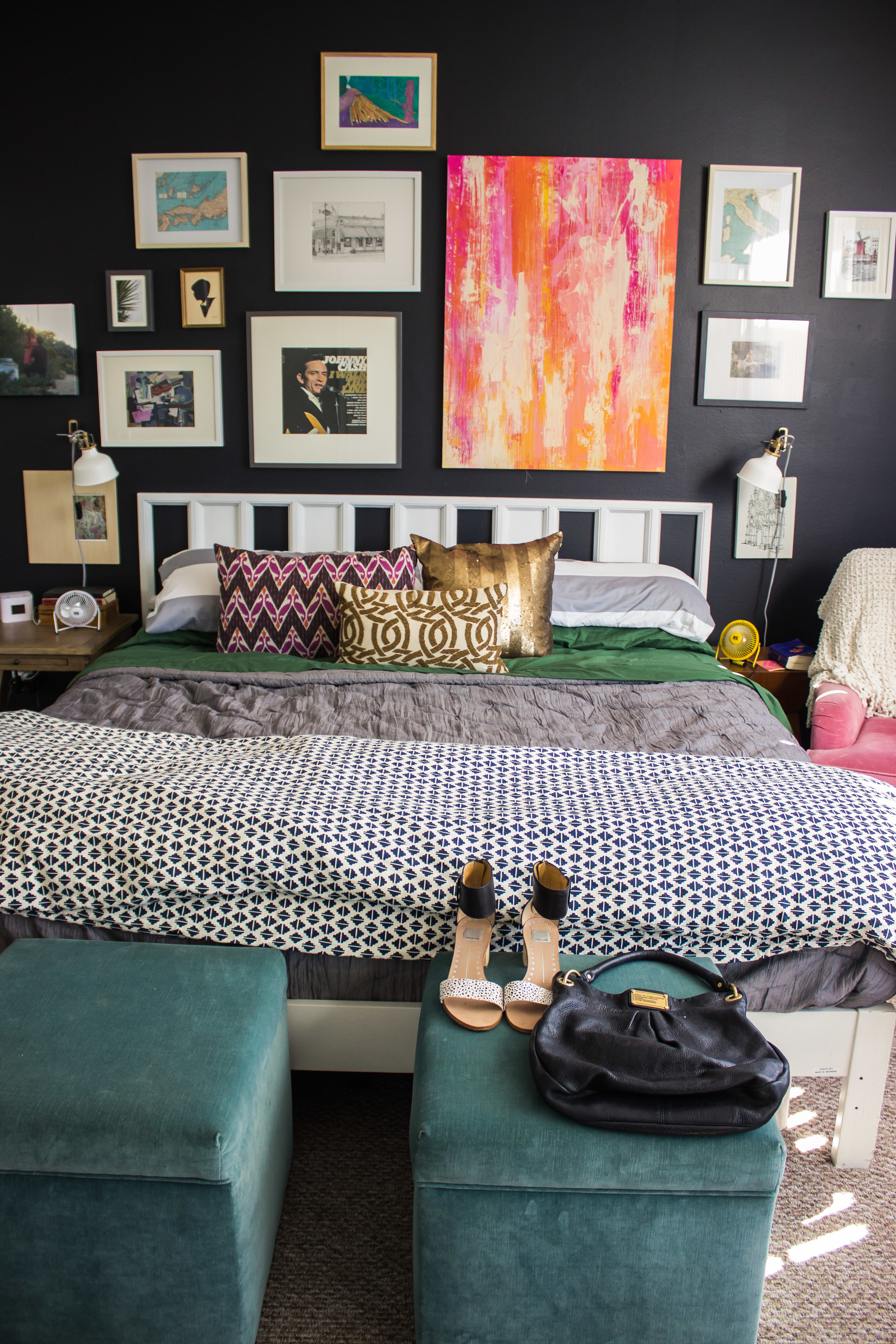
our bedroom is the most complete room in the house. i was just so excited to have my own side of the bed- it's a serious game changer, especially being pregnant and trying to get out of bed at night. i decided to put that chair in my room because a. we are having a boy and i didn't want to embarrass him by putting a pink chair in his room (like i embarrassed his dad when pb teen reposted our old bedroom- he was so upset that they couldn't tell a man lived in the room). and b. i wanted it for nightly feedings, and work- since i usually work from bed.
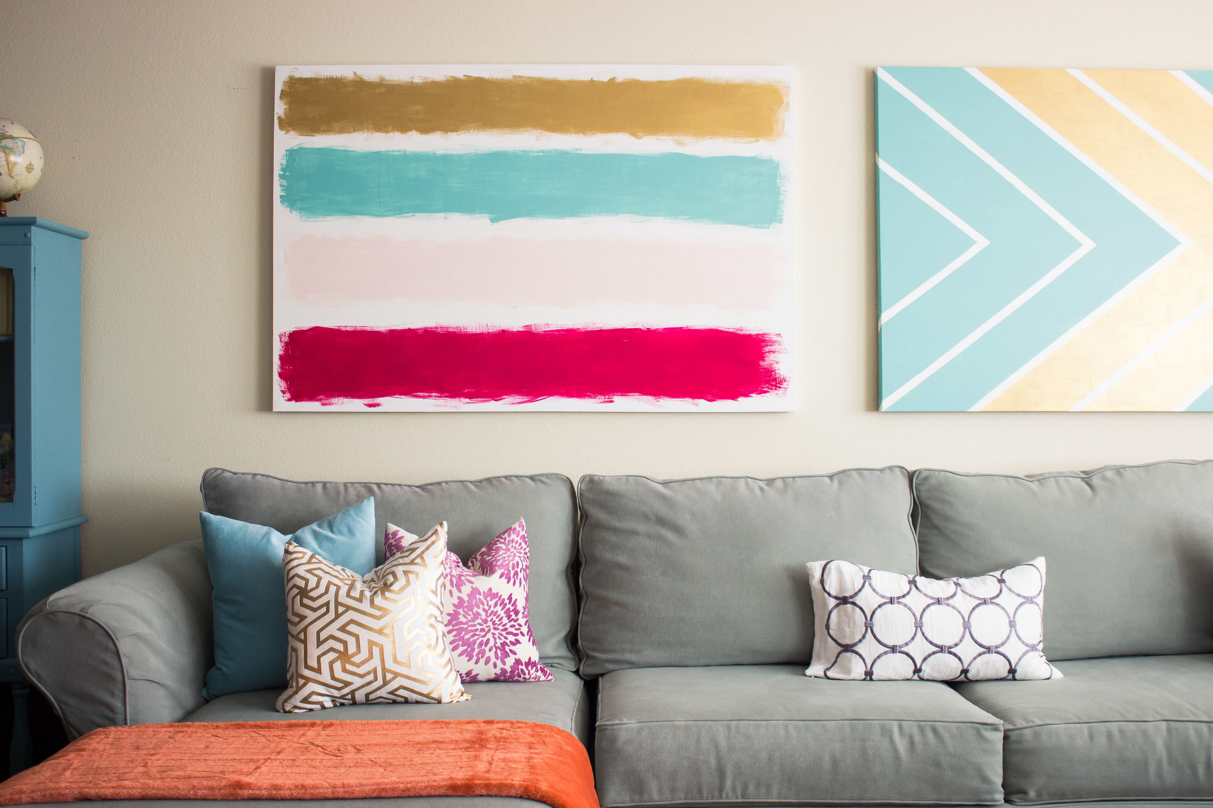
after the whole pbteen 'incident', jarman was more opposed to having a pink canvas above the bed. so we appeased him by making a 'his and hers' art wall! we put his favorite artworks on his side (including the drawing of his grandpa's favorite restaurant, the crab cooker), and all of mine on my side.
oh my gosh, how about that black wall though! i am so obsessed with it. for some reason our development decided to have a rust red accent wall in every single master bedroom. i told jarman that there was no way in hell that i could live with that, so we painted it black the day we moved it. and i'm so glad we did- i love how it looks with my white bed and all of our artwork. and don't you love those $20 ikea sconces? and our matching fans:)
i decided i could no longer stand to live with the vintage chartreuse dresser that has a missing drawer. we had some good times, but i was done. so we got some more ikea cubes (like we have downstairs- don't judge me- they are really cheap and versatile). i eventually want to add the drawers that you can get for it, but i'd rather get new pillows first so i'm in no rush.
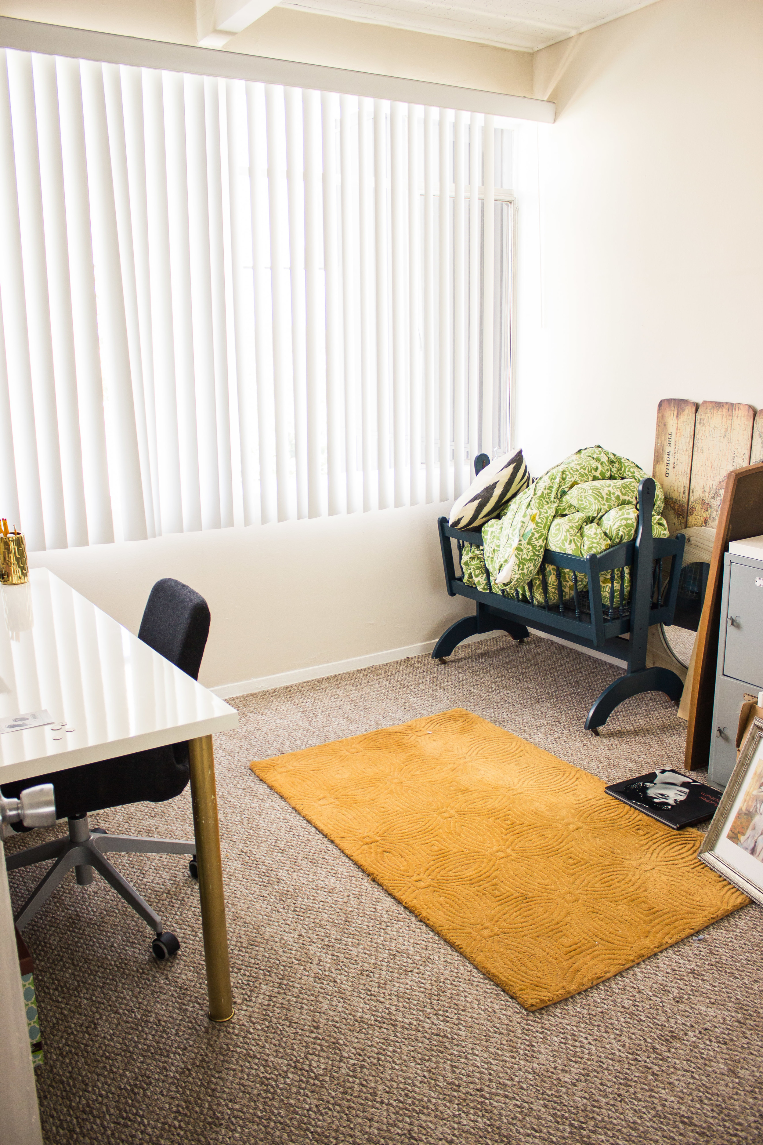
and finally- the second room that has to fulfill all of our needs: baby room, office, and storage. also, where we shove things that don't have a place yet. should i be freaking out that it looks like this and i only have 84 days until my due date!?
sorry for the longest post ever written. i can't wait to share how everything turns out- though it's going to be a very slow process getting it all done!

